The Evolution of THE STARTUP WAY Cover
Guest post by Marcus Gosling, VP of Product, Long-Term Stock Exchange.

I’m excited to reveal the final cover for Eric’s next book, THE STARTUP WAY, coming October 17. I’ve been working with Eric since the IMVU days and designed the cover for The Lean Startup… I was excited to help with the new cover and, after months of testing different iterations, we’ve decided on a design that checks all the boxes that Eric, the Crown Business publishing team at Penguin Random House, and I wanted to hit going into this process:
- It’s eye catching, whether on a bookshelf or online storefront
- It demonstrates a clear evolution from The Lean Startup
- It captures the book’s message of entrepreneurial management
- And, of course, it tests well with buyers

The first drafts I showed to Eric and the team played with two graphics: an infinity symbol and a chevron. The infinity symbol represents the continuous innovation that’s possible within any organization, regardless of size. The chevron represented a clear path into the future through entrepreneurial management. While both are essential concepts to the book, the chevron was a clearer departure from The Lean Startup circle. We looked at a number of color treatments for both graphics and knew we wanted to test several options.

We also looked at the cover options in a field among other business books. It was important to know that our jacket would stand out to readers looking for the next great business book.
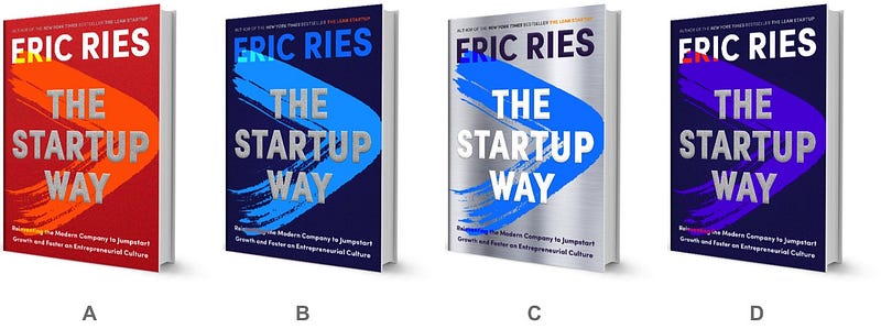
Once we decided to focus on the chevron shape, I started playing with the color scheme?—?some variations on The Lean Startup scheme and some total departures. While anyone who caught a glimpse of the options had an opinion, I knew we wanted to test buyer decisions rather than simply survey friends and family.
We ran ads targeted toward business readers on Facebook with the four different cover variations shown above. Clickthrough was strongest on the red cover with silver in second. We tested the actual purchase decision on our testing site, thestartupway.co. The blue covers led the way, followed by red, then silver a distant fourth.

We realized we ran the Facebook ad with the cover on a dark backdrop while the testing site had a white background. Given most buyers are shopping online, we had to see how the covers would look in an online retailer’s storefront. As you can see on the CEOreads page above, the silver was quickly lost on the white background. I tweaked the color schemes to find a blue chevron we all liked and we moved forward with testing one red and one blue design.
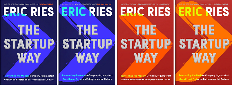
Down to these two color schemes, I extended the chevron to the edges of the page, adding to the boldness and drama of the design. With that change in place, Eric had a new test in mind, one we had run while designing The Lean Startup cover.

Using a website called fivesecondtest.com, we showed participants one of the two bookshops above for five seconds. When the image disappeared, we asked which books they recalled seeing. 2/3 of all respondents named The Startup Way as one of the first three books they remembered, with participants shown the red cover slightly more apt to name the title.
Anecdotally, but interestingly, a few participants mentioned the “red book” or the “orange business book” while there were no comparable mentions for the blue cover.

We continued testing clickthrough on Facebook, where there wasn’t a discernible difference between the red and blue covers.

At the same time, we tested purchase decisions on the book landing site, where the red cover held a slight edge over the blue. Given the buying preference for the red cover (and my and Eric’s personal inclination for it, assuming testing didn’t show it to be a terrible option), we decided to move forward with the red design.
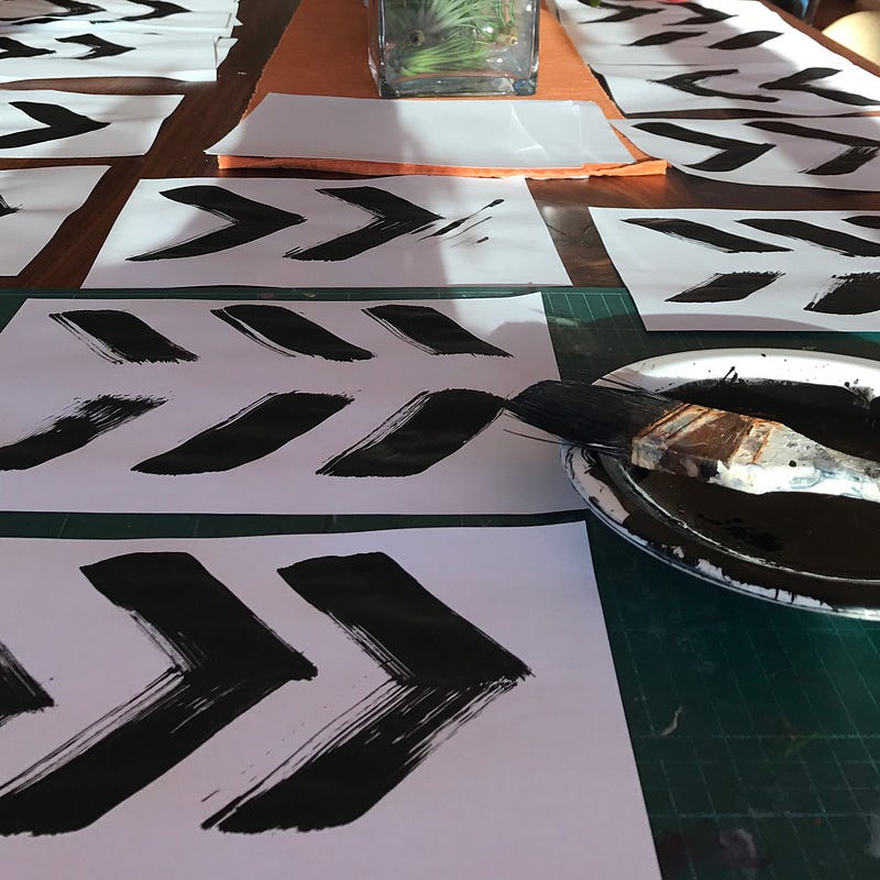
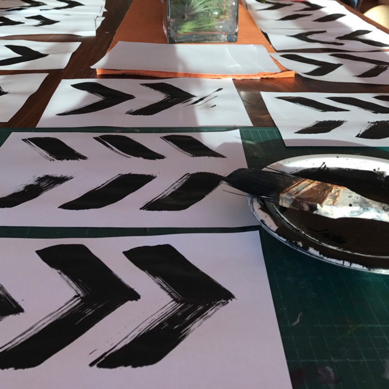
Once we were settled on color, I spent a Sunday afternoon, paintbrush in hand, modifying the brushstroke of the chevron.

The outcome of the paint party was an evolution in chevron design, from smooth to more energetic. Eric liked the options with more streakiness to the chevron; we both felt the streakiness indicated a work in progress. The busier the streaks became, though, the more the title became lost in the design.
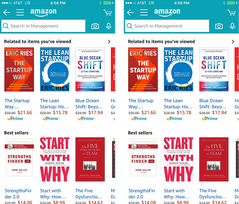
While the silver title, much like the silver cover, would look great on a bookshelf we decided to see what it looked like in an online storefront vs. a white title. It was immediately evident that the white title popped off the page regardless of how streaky I made the chevron. While Eric and I continued to tweak, we stuck to a white title from then on.

We played with chevron angle, thickness, size, streakiness, and splatter. The above shows how far we’ve come from the first draft. We tweaked accent colors, font style, font size, and font spacing. Three and a half months after our first conversation about chevrons and infinity symbols, we’re excited to reveal the final cover for THE STARTUP WAY:
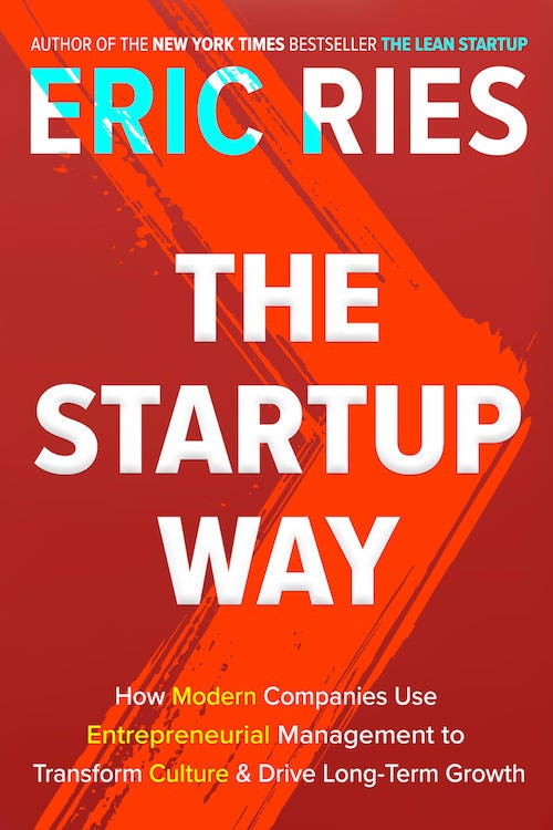
Thank you to the Crown Business team who managed the Facebook and five second testing, to anyone who preordered through the landing site (whether you knew you were part of the testing or not!), and of course to Eric for helping balance art and science in the design process. We can’t wait to hear what you think of the physical product when it hits shelves October 17!
Originally published at www.startuplessonslearned.com on June 20, 2017.
